-2.png?width=221&height=60&name=Navigo_Logo_High_Res%20(1)-2.png)
Overview
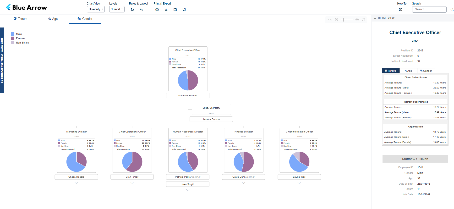
The Diversity Chart presents workforce composition across three views, Tenure, Age and Gender, mapped onto your org structure. Each position card carries a breakdown and a graph covering the team reporting to that position, so composition can be read at team level as well as across the organisation.
All tenure, age and composition figures in this chart are calculated within org.manager from the employee data you supply. They are not read from your HR or payroll system as pre-calculated values, which means the bands, thresholds and averages can be configured to match the definitions your organisation already uses.
This chart is designed for users who need to understand the demographic shape of their workforce. It is typically used by HR teams and authorised managers to support diversity reporting, succession planning and workforce planning.
Objectives
- Show workforce composition by tenure, age and gender at both team and organisation level
- Let managers compare their team's composition against the organisational average
- Highlight retirement exposure and tenure concentration to support succession planning
- Give HR teams a consistent, repeatable basis for diversity reporting
Required fields
To get the most out of this chart, the following additional fields are generally recommended:
- Date of Birth
- Gender
- Join Date
- Employee Status
- Employee ID
- Position ID
Conditional Formats
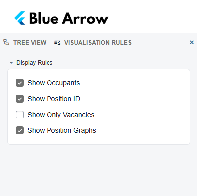
The following display options can be toggled to customise what appears on the chart:
- Show Position ID - displays the unique identifier for each position
- Show Position Graphs - displays the composition breakdown and graph on each position card
- Show Occupants - displays the name of the employee filling a position
- Show Only Vacancies - filters the chart to show unfilled positions only
Legend
The chart has three views, selected from the tabs above the chart. Each view has its own breakdown, graph and highlight legend.
Tenure
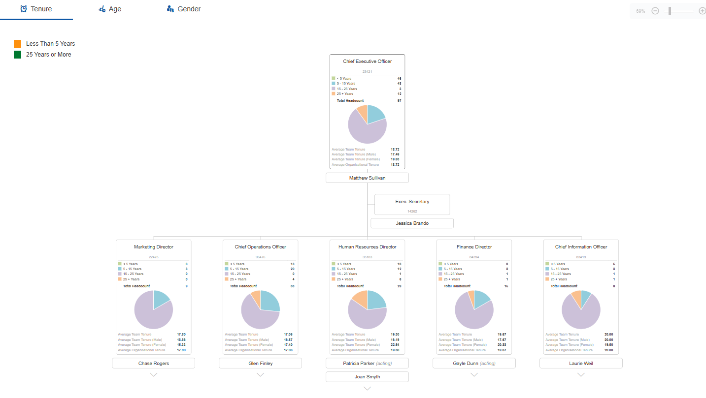
Position cards show headcount split across four tenure bands, Less Than 5 Years, 5 to 15 Years, 15 to 25 Years and 25 Years or More, with a total headcount and a graph of the distribution. Below the graph, the card shows Average Team Tenure, Average Team Tenure (Male), Average Team Tenure (Female) and Average Organisational Tenure, so a team can be read against the organisational average at a glance.
Highlight colours:
- Orange — Less Than 5 Years
- Green — 25 Years or More
Age
Position cards show a table of headcount by age band and gender, covering Under 25, 25 to 35, 35 to 45, 45 to 55 and 55 and Over, with totals. Below the table, the card shows Average Team Age, Average Team Age (Male), Average Team Age (Female) and Average Organisational Age.
Highlight colours:
- Orange — Nearing Retirement (5 Years)
- Red — Eligible for Retirement

Gender
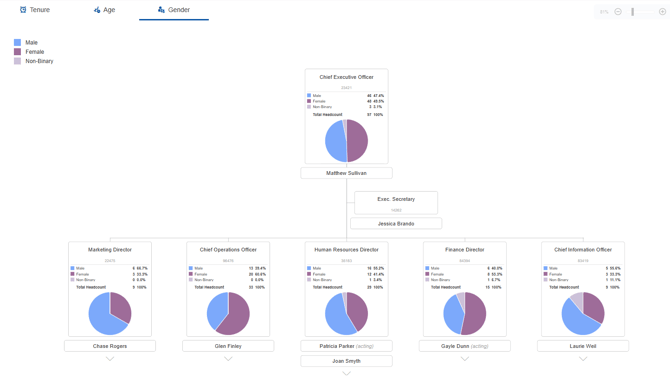
Position cards show headcount and percentage of total for each gender category, with a total headcount and a graph of the split.
Highlight colours:
- Blue — Male
- Purple — Female
- Light purple — Non-Binary
The Gender view reports against these three categories.
The tenure and age bands, and the highlight thresholds on all three views, can be customised to reflect your organisation's specific reporting definitions and policies.
The criteria for this legend can be customised. A different field category can be used, either against positions or employees, to suit your organisation's needs.
Vacant positions
Vacant positions appear in the chart structure, but they are not included in any of the composition figures. Every tenure, age and gender calculation is based on the employee occupying a position, so an unfilled position has no data to contribute and is excluded from the headcount totals, band breakdowns and averages.
Use the Show Only Vacancies conditional format to filter the chart down to unfilled roles only, which is useful when reviewing recruitment against composition targets.
Formulas
All of the following are calculated within org.manager and are not required as inputs from your source system. All are based on occupied positions only:
- Age
- Tenure
- Direct Headcount
- Indirect Headcount
- Total Headcount
- Headcount by tenure band
- Headcount by age band, split by gender
- Headcount by gender, as a count and as a percentage of total
- Average Team Tenure, and by gender
- Average Organisational Tenure
- Average Team Age, and by gender
- Average Organisational Age
- Average Tenure and Average Age for Direct Subordinates, Indirect Subordinates and the Organisation
Security
This chart is intended for HR administrators and authorised managers only. It surfaces sensitive personal data including date of birth, age, gender and retirement eligibility, so access is restricted to a specific user group to ensure it is only visible to the right people. During implementation, we will workshop your specific security requirements.
Mapped fields
The fields shown in this chart are fully customisable. If there's something your team needs to see (or doesn't), we can configure the chart to match - just let us know.